This is my first vodcast in which I will be talking about Titles and explain the idents of my 5 genre specific horror movies.
Script:
"This is my first vodcast in which I am analysing good examples of titles and identsshown at the beginning of the 5 genre specific movies I had to analyse in class. Very often these idents and titles are used to establish and show the genre of the movie to the audience, before the movie actually starts.
In this movie, the ident of "Lionsgate" has been used to emphasise on the horror genre. Usually the identlooks exactly like this. So you have the "Lionsgate" ident surrounded by a blue sky and clouds.
However, in the movie "The Cabin in the Woods", the media producers decided to put it like this, so with red clouds, really trying to emphasise on the genre.
Another great example of a movie where the idents have been used to establish the genre, is the film "The Conjuring". In this film, there are two main production companies. One of them, which is Warner Bros. that has the ident that usually looks like this, and the other production company is New Line Cinema where the ident usually looks like this.
However, in this film, "The Conjuring", the media producers decided to put the idents in very dark colors, so they made it with grey clouds in the background to really underline the horror genre and also create the tension within the audience.
There was also a non-diegetic sound in the background of drums and very dark music, so this also added to the tension and the genre.
A very good example where the titles have been used to emphasise on the horror genre is this movie called 'Insidious'.
In this case, the media producers decided to put the production companies names first in a red font and let them turn into a grey smoke and then fading into black one by one. The font strongly links to the convention of the horror genre, since the red color often symbolizes blood, danger or hell.
When the titles of the actors appear on screen, they are shown on a background of black and white pictures of the outside and inside of a house.
This really stands out and a clear contrast is created. The audience focuses on this contrast and this again emphasise on the horror genre and creates tension.
Director:Jim Sheridan
Writers:David Loucka
Actors:Daniel Craig, Rachel Weisz, Naomi Watts
Production Companies:Cliffjack Motion Pictures, Morgan Creek Productions, Universal Pictures
Budget:$55.000.000 (estimated)
Genre:Mystery, Drama, Thriller
Storyline:
Some say that all houses have memories. For one man, his home is the place he would kill to forget. A family unknowingly moves into a homes where several grisly murders were committed… only to find themselves the killer's next target.
Titles:
When the very first ident of Universal pictures opens, there is a non-diegetic sound of a little girl humming a song in the background. At one point there are added very slow bells to it, which come across as a very mystical sound.
As the ident of the Morgan Creek Productions comes up, the non-diegetic sound of the voice, bells and this time also flutes continues. The bells could also suggest that it is Christmas.
When the title of the movie 'Dream House' appears on screen with a black background it is a very neutral and white font.
After this small opening sequence, the audience sees a low angle shot of a tall building while it is snowing from the outside.
We are introduced to one of the main characters, while there is a magical non-diegetic sound appearing when we first see this character. We follow some of their dialogues and come to notice that he is quitting his job to be able to write a book.
In addition, we then see a close-up of a book lying on the table with drawings and notes in it. On the front, you notice that it says 'Daddy's Dream House'. This could imply that the font from the title of the film has been chosen on purpose, since it could represent the titles of a book cover.
What is interesting to notice, is that there is no 'real' opening sequence besides from the identsappearing with the non-diegetic music and the title of the film. This means that it was chosen to put the credits at the end of the movie in stead of the beginning, which is very unusual. One reason for this could be because they want the audience to notice every hint being dropped that could show the genre of the movie.
Semiotics:
In the case for this film we can't really make any comments on the font, since there is no font to see except for the one that is in the title. As mentioned before, the title of the film could have been a font chosen on purpose to represent the book covers since the audience finds out that the main character wants to write a book.
In addition, we could interpret, that the low angle shot in the beginning of the film is a sign of showing the audience that the main character is in a high position. We later on find out that he is or has been an editor and that he will be missed by his co-workers, since they drink champagne before he leaves to wish him well.
Moreover, the close-up of his book that says: 'Daddy's Dream House', is a signifier that he could have children.
For the symbolic level, we know that the non-diegetic magical music being played, when we are introduced to the character, symbolizes the piece and happiness in his life.
Moreover, snow and the magical sound at the same time are very often interpreted as either Christmas time or just a cold time of year.
Narrative exposition:
In this opening sequence, we can apply Todorov's theory, since there is firstly established an equilibrium. This is established, when we see the first main character and there is a magical non-diegetic sound appearing. Due to this, we know for a fact that all is well and nothing is going to happen yet.
Actors: Patrick Wilson, Vera Farmiga, Ron Livingston
Production Companies: The Safran Company, New Line Cinema, Evergreen Media Group
Budget: $20.000.000 (estimated)
Genre: Horror
Storyline:
In 1971, Carolyn and Roger Perron move their family into a farm house and soon strange things start happening around it with escalating terror. In desperation, Carolyn contacts paranormal investigators to examine the house. What they discover is a satanic haunting that is targeting the Perron family wherever they go.
Titles:
From the beginning on, when the idents of Warner bros appear, the audience are immediately introduced to the genre. Usually the Warner Bros ident is golden with a blue sky in the background. However, in this film, it comes up with thunder and black clouds in the background. So in this movie, the idents are essential, since they are the ones creating a tension within the audience.
The new line cinema logo appears in the exact same way and has the same influence on the audience as the Warner Bros. ident.
While these idents are presented to the audience, there is a non-diegetic music of drums and trumpets. This non-diegetic music is also underlining the scarifying genre.
In the opening sequence of the movie, which lasts about two minutes, there are no titles or opening credits appearing on screen. The audience is immediately shown an extreme close-up of a blood covered, old doll. The blood and the wide open eyes, suggest that something isn't right and also emphasise on the genre.
Semiotics:
The coloring used for the introduction of the idents, suggest that the genre is going to be horror or thriller. Very often in these specific genre films, the colors grey, red and black are used. The reason for this is because, red could be used to emphasise that blood will be spilt, whereas black and grey are very dark colors that create a dim and gloomy setting with the help of lighting as well.
In the opening sequence of this film, there aren't many symbols that represent the genre of the movie except for the doll. In many horror movies, an old doll, with wide eyes and blood on it's face is used as a symbol for horror. However in this film, we know that the focus will probably be on the doll, since it is the first shot we see.
There are a few seconds after the idents have appeared where the screen is black and we hear a voice-over of a woman saying:"You will think I am crazy" where upon a male voice-over replies and says:"Tell me everything." We are then introduced to an extreme close-up of a dolls face, and immediately know that something is not right since it's eyes are wide open and it is covered in dirt and blood.
The mise-en-scene of the doll is very scary and this as well is something emphasising on the genre of the movie.
After the male voice-over has said: "Tell me everything.", we are being told the story of the doll by the woman who says that it had been possessed by a girl named Annabelle. All of this, she is telling two people who sit in front of her and her two friends, which are questioning all three of them out about the doll. Due to this, we could interpret that the two people might be police officers or people investigating on the case.
We are then taken back in time, where the entire story is explained to the audience.
Narrative exposition:
The only theory that can be applied to this movie is Barthes concept of the Narrative Enigma. For example, there is an enigma code, since there are clues being dropped about the doll and what the film will be about.
Writers: David Lindsay-Abaire, Steven Spielberg, Michael Grais, Mark Victor
Actors: Rosemarie DeWitt, Kennedi Clements, Sam Rockwell
Production Companies: Fox 2000 Pictures, Metro-Goldwyn-Mayer, Ghost House Pictures,
Vertigo Entertainment, TSG Entertainment Budget: $35.000.000 (estimated)
Genre: Horror, Thriller
Storyline:
A family whose suburban home is invaded by angry spirits. When the terrifying apparitions escalate their attacks and takes their youngest daughter, the family must come together to rescue her.
Titles:
In this movie, the idents of Fox 2000 Pictures, Metro Goldwyn Mayer and Ghost House Pictures come up as normal and there hasn't been a change of coloring or anything else to emphasise on the genre.
All of a sudden, there is a multicolored pattern on the entire screen, that comes across as futuristic and sci-fi genre. It is moving in an odd way, which suggests mystery and somewhat a ghostly aspect to the movie.
The titles of the production company appear on this in a white font.
After this, there are no titles or credits, and we are immediately introduced to the main character's and the entire family.
We meet all 5 family members when we see them driving around in their car through a street full of houses. Through the chosen mise-en-scene of the what they are waering and the way they are sitting in the car, we are introduced to who they are, and find out that they are about to move into a new house on that street. Then, the camera pans to the right and shows the audience a high angle shotand estbalishing shot of the fields and houses. This shot is very useful to establish the peaceful setting and show the audience where it has been filmed.
Moreover, the shot is being shown on screen for a very short time, due to this, you have to re-watch the opening sequence 3 times before noticing that the title of the movie "Poltergeist", is actually written in the grass on the field.
Since it is very well hidden and the last bit of the title "Geist" means ghost in German, we could interpret that the movie will definitely be about ghosts who are hiding in the beginning, but will play a big role in the film at a later point.
Semiotics:
Since there isn't a big opening in this film, and the font chosen is in a neutral white color and font, we can state that the color doesn't really play any signifying role in this film opening.
However, when the multicolored pattern comes up at the beginning of the movie, there is a significant sign that emphasises on the horror genre of the film. For example, the pattern turns into being a skeleton or a zombie on an I-Pad game, which the boy is playing. This emphasises on the horror genre.
After, seeing that it is just a game on an I-Pad, the film continues by introducing the audience to all five family members. There is established a very familiar and peaceful setting within the audience, since it is just an everyday situation of a family sitting in a car.
Narrative exposition:
For this opening sequence you could apply two of the four key theories. One of them would be Todorov's Narrative Formula, since there is established an equilibrium in this first scene. We know that all is well, since the sky is blue and the family come across as very happy to move into their new house. On the other hand, we can also apply Barthes theory of the Narrative Enigma, since there is an enigma code of clues being given. Especially after we see the title written in the field and we can interpret it as a ghost being hiding.
Actors: Chris Hemsworth, Kristen Connolly, Anna Hutchison
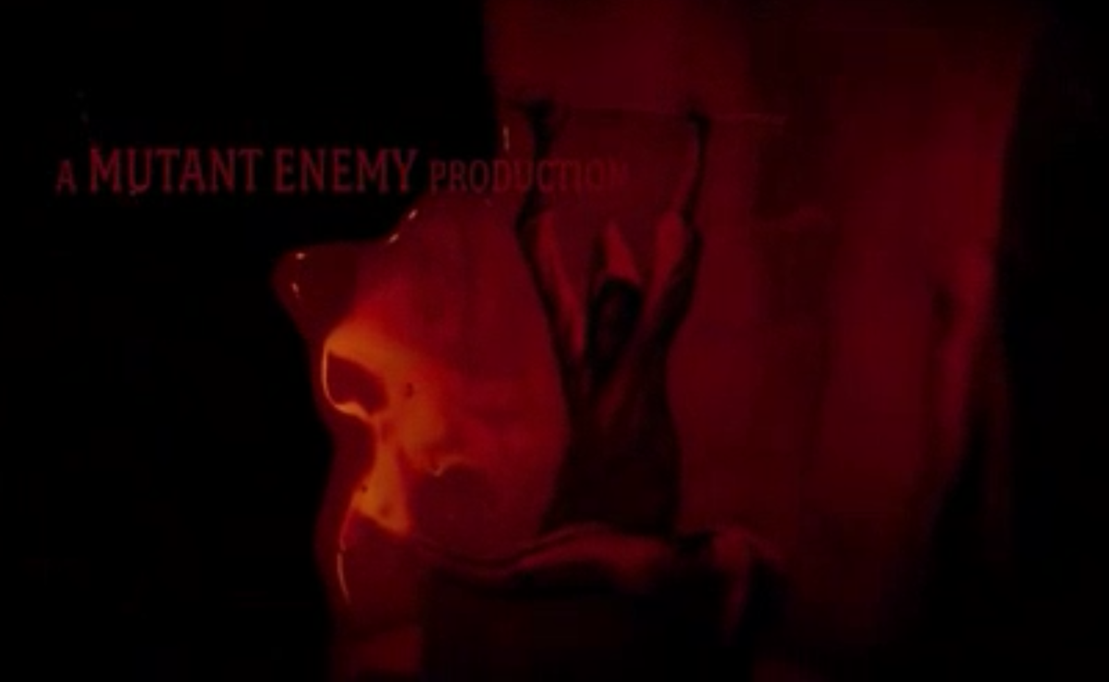
Production Companies: Lionsgate, Mutant Enemy
Budget (estimated): $30.000.000
Genre: Horror, Thriller, Mystery
Five teenagers head off for a weekend at a secluded cabin in the woods. They arrive to find that they are quite isolated with no means of communicating with the outside world. When the cellar door opens, they go down to investigate. They find an odd assortment of relics, but when one of the women, Dana, reads from a book, she awakens a family of deadly zombie killers.
The idents of this movie are "Lionsgate" and "Mutant Enemy". In most movies, the ident of "Lionsgate" is known for opening up doors where it's title then shows up on a background of a blue sky and clouds.
However in the case of this movie, there is a binary opposition, since this time the gates are not opened to heaven, but are opened to hell.
This change of the "Lionsgate" ident, already emphasises on the genre of the movie due to the color, but also the non-diegetic sound of old rusty metal when the doors open up.
After this, the screen goes black and there is blood everywhere, while the titles of the director, and the production companies show up.
When the two men who have been introduced to earlier drive around in a mini car, the man on the right talks about that he needs to pick up some things. In that very moment that he says that, there is a freeze frame and the title of the film "The Cabin in the Woods" is projected on screen. That same second, there is a non-diegetic sound of a scream.
It is written in capital letters and in a big red font. Again the color red is used. This color is known for several things such as blood, anger etc. The chosen font and the scream underline the horror genre of the movie.
The camera then changes from the freeze frame to an establishing shot, of a boy riding his skateboard in a neighborhood. It is sunny outside and everything seems very peaceful after the scream we had just heard.
There are only about 5 different titles of actors that show up on screen. Due to this, we can conclude that there is probably not any supporting cast in the film, since it is just about these 5 going to the cabin.
Furthermore, the font of the titles are written in red and in blood. Each time the names of the actors, producers etc. disappear of screen, they fade away and the blood runs down from the name.
The way that the media producer has chosen to make the red font drip down the screen as if it were blood helps the audience to identify the genre. In the opening sequence there are pictures shown in the blood. These pictures show old myths and rituals. This entire opening and it's font where used to convey meaning to the audience, since it was clearly portrayed to them, that the genre would be horror.
The overall effect of this red color is that it connotes the genre of the movie and indicates that blood will be spilt and the actor's we see on screen will most likely suffer.
Especially in this part of the film opening, the media producers may have wanted it to look like big pools of blood. In these, the audience can see pictures of hooded men, a women sitting etc. It looks a bit like pictures taken out of books from old myths.
Moreover, there is a very dark and mystical non-diegetic sound of a song playing in the background. This is added for effect, again to build up tension in the audience.
In addition, there is blood mixed with flames and what looks like lava. This again emphasises on the genre, since it is the typical signs an audience looks for in a horror movie. Especially blood.
All of a sudden, there is a binary opposite created, when the opening sequence ends out of the blue and a mid-shot of a coffee machine comes up on screen.
This binary opposition is very clear and straightforward to notice, since it goes from a dark and red image with a dark sound of drums in the background to a mid-shot of a happy feeling of a nice cup of coffee and no music at all in the background.
There is a conversation taking place between these two men for a while.
While they are having a conversation they walk around the place where we assume that they are working. This helps the audience to establish a setting. In addition, the mise-en-scene of the costumes could hint that they are working at either a hospital, a lab or something similar.
In the case for the symbolic signs in this movie, you could notice that the colour red was being used very often. On many occasions, the colour red signifies passion and love. However in this film, you can immediately notice that it signifies hell, anger and blood. The audience can notice this, due to the chosen non-diegetic music and other signs such as the blood and the fact that all the titles have been written in red.
In this opening sequence, we are introduced to two actors that we consider to be working in a lab or hospital. After this, the audience is introduced to the main actors in the movie. It is sunny outside and they are laughing together. This definitely suggests that Todorov's theory of the narrative formula has been implied since there is an equilibrium.
Since the task was to analyse the opening sequence and not the entire movie, it is difficult to say if the institution has created this movie with the entire conventional structure suggested by Todorov. However, we can state that in most horror movies it is often the case that this narrative structure is not being followed except for the first 2 steps.
Through the chosen structure of the opening sequence, with having the introduction in red and blood and then creating an equilibrium, the audience knows that something is about to happen and that there trip to the cabin probably wont work out the way they expect it to be.
Moving on to discuss the conventions of the horror genre, we can state that "The Cabin in the Woods" is a great example of the ususal scream queen/final girl.
In the film opening, we find out that the girl with the brown/reddish hair who is portrayed as smart with all of the books on economics that she has packed and the creative drawings, is the one that survives in the end, whereas the typical blonde is one of the people who is killed first. Her friend is pictured as the stereotypical dumb blonde, who does whatever she pleases, by throwing out a drawing.
Producers: Jason Blum Actors: Patrick Wilson, Rose Byrne, Ty Simpkins Writers: Leigh Whannell
Production Companies: Alliance Films, IM Global, Haunted Movies Budget: $1.500.000 (estimated)
Genre: Horror, Thriller, Drama, Mystery
Insidious is a movie from 2010 about a family in search of help for their son, Dalton, who fell into a coma after a mysterious incident in the attic. Little do they know that there is much more to this endless sleep than meets the eye as they explore the paranormal, and rediscover the past; they key to getting their son back once and for all.
The production companies for this movie are Alliance Films, IM Global and Haunted movies. When the ident of Alliance Films comes up, there is a non-diegetic sound of a high pitched tone in the background.
Next there is ablack screen coming up with all three identsspelled in a red font. They are shadowed in a reddish color and then fade upwards into a grey smoke and then each letter fades into black one by one until there is an entire black screen again.
The darkness and the blood like color that have been chosen are used to create the tension and establish the genre to the audience. Moreover, the font strongly links to the conventions of the horror genre as well.
During this entire process, there is a non-diegtic sound of scary music in the background. One can immediately tell that the music is meant to emphasise on the genre and create suspension since it is very high pitched and specific instruments have been chosen for this part.
When the name of the director, James Wan, appears it is seen within a white ball. In the beginning the audience would consider this to be an ordinary introduction of the director's name.
However, it turns out that the white ball is a lamp within a room hanging by the ceiling. The audience is immediately introduced to the first setting of a boy's room. We can notice this, due to the mise-en-scene of the bed-sheets and the small night table with toys on it next to his bed.
When the film title of the movie appears, it is very sudden and out of the blue. In addition, there is an immediate non-diegetic music of violins playing very fast and dramatically. This adds to the drama genre, since violins are very often being used in these type of films, since it is able to built up a tension within the audience.
The movie title's font is in red as well. The word 'Insidious' is written in capital letters while there is fire burning underneath it and the tips of each letter look like small horns. This could signify the devil and hell, which is definitely also contributing to the convention of the horror genre.
When the titles of the actors appear, there are shown on black and white pictures of the outside and inside of a house. The red color really stands out since it is such a strong color and a clear contrast compared to the black and white.
Again it is being projected the same way as the idents of the movie since this also fades into grey smoke.
Meanwhile, the non-diegetic music has changed completely since it is now very calm and barely hearable.
In this text, the dominant elements were the color choices, especially when there was the clear contrast with the red fond on the black and white background. This really made the audience focus on the red color and it's hint to the genre.
As in many horror movies, the color red is used as a symbol for blood, danger, flames and hell. However, in this movie, the red color fades into grey dust, which has a sort of 'ghostly' appearance over it, so it could definitely be interpreted this way.
Furthermore, the way that the media producers had chosen to light the boy's bedroom and the rest of the house as very dark and gloomy, already made the audience feel the scarifying tension. There was also a very smooth introduction to the opening on the film, when the director's name appeared in a white ball that then went over to being the lamp in the boy's bedroom. This was a very good transition and a good way of getting the audience attention, since something happened immediately.
In this case, there is an enigma code, since the darkness e.g. lighting, and the non-diegetic music in the film refer to mystery within the movie. Moreover, there is an action code, since the chosen way of letting the font fade into a grey color, that could be interpreted as a ghost, is used to create tension and suspense to the audience.
Below you can see a a discussion from James Wan, the director of Insidious who explains why he started with a horror genre, and what he thinks of it. He believes the horror genre to be the one that every good director he knows starts out with. He is also talking about the typical development of the character. He says that the role is to make the audience care for the main character before any of the tension starts, so that the audience get up into their seats once the actual tension starts.
Creating a continuity task involving filming and editing a character opening a door, crossing a room and sitting down in a chair opposite another character, with whom he/she then exchanges a couple of lines of dialogue with. This task should demonstrate match on action, shot/reverse shot and the 180-degree rule.
When analysing and comparing this continuity task to our micro-drama, we can state that this has been filmed better in terms of choosing different shots and angles types.
In this case, the task was to film a character opening a door and crossing a room to then exchange a couple of lines of dialogue with another character.
The first shot we see is a long shot, of Bronnie Vaughan walking accross a pavement outside. Since she is later on talking to a teacher (played by me), the audience knows that it has been filmed around a school. This let's the audience establish a setting.
The shot after this is an over-the-shoulder shot of Bronnie looking at the door. This shows the audience that she is about to go inside of the school.
The shot after this one is an eye-level shot that has been taken from the inside of the school. This shows the audience how she is opening the door and how the sound changes from when she was outside, to when she is inside.
For the next shot, we took it in a low angle. This shows how she is walking very straightforward and determined inside the school building.
The following shot is a two shot and mid-shot where Bronnie walks past me (playing a teacher). This shot was created to show the audience the difference and comparison between the two characters. The teacher as a very tall person with glasses and hair tied back and the student with her hair loose who looks a bit younger.
In the next few shots, there is a shot and reverse shot changing to represent the dialogue between the two character's.
After the few lines of dialogue have been exchanged, we decided to create a long shot, where the audience again sees the mise-en-scene that is within a school. but also sees how the two character's walk their own ways, emphasising on the fact that the movie is over.
Below this you can see the video for our final cut of our Micro-Drama.
Below this you can see the storyboard, which was created by Bronwen Vaughan.
Pre-production:
Before we started with filming we had to do a lot of planning. This involved a brainstorming session, where we had to make decision about the genre and target audience of our micro-drama.
We immediately chose "melodramatic horror" as the genre and young adults/students as our target audience.
In addition, we discussed the possible narrative threads and the possible casting. This was important, since we had to apply the key theories of Propp's, Barthes, Todorov and Levi-Strauss and therefore had to figure out who would act, which role so it would apply to these four key theories.
Furthermore, Bronnie Vaughan and Riona Dragonsfeldt from our AS media class decided to start drawing and creating the storyboard for our micro-drama. A storyboard is useful and meant to show the character details, mise-en-scene and the different kinds of shot types.
Moreover, I then wrote our script for this short micro-drama. For this, we had decided to work with Adobe Story, which is a website with a scriptwriting software to efficiently help people to create their scripts. → https://story.adobe.com/de-de/index.html
Lastly, we took the rest of the time to scout for locations and think about where we could create our setting.
Production:
For the actual production of our micro-drama, there was a rehearsal of the created script.
After this, we decided to do a test shooting to figure out which camera shots and angles we should use in our movie. This is always very helpful to do, in order for everyone to know what their task is in order for it not to be more time consuming than it already is.
Furthermore, we were shooting on two different locations. One of these was at a house in the city of Luxembourg whereas the other location was in a village called Junglinster in Luxembourg.
These two locations were fitting into our story, since the setting was "6 students huddled around a bonfire" and then "leaving to go see the haunted house". The village Junglinster was very fitting, since it has this old mansion, which we were then able to use as a haunted house for our short film.
Finally, after we had gotten all of our material, we started editing. This short film was edited by Jonathan Paris and Kristian Ovreeide from our AS media class.
Post-production:
For the post-production of our film, there was a public screening in our classroom. After this, it was very important to crtically reflect the effect and meaning of our chosen shot/angle types and sound effects.
In addition, we then had to analyse how the narrative theories had been shown.
When creating and analysing your own personal short film, you realise how much work there needs to be put into it and how time consuming it is. You also notice, after it has been edited, what you could have done to improve it or change it.
In the case for this short film, the first shot was a mid-shot of two of us sitting on a bench. There should have been created an establishing shot instead for the opening, since this would have allowed the audience to create a setting.
The next shot, on the other hand is a long-shot that let's the audience establish a setting, since you can see the bonfire, a garden and how many character's there are.
However, when you continue to watch the film, you will notice that these are the only shots that appear before the scary stroy is being told. This means that there are no close-up's of each individual to show emotion or their reaction.
As mentioned before, the task was to apply some of the 4 key theories to the film. In this scene, we are all talking about a Halloween party and what we will dress up as. Through this, we tried to apply Propp's character archetypes theory.
For example Kristian (wearing blue and red on the right) says that he wants to dress up as superman. This can be taken as a hint for this theory since he is the one who we find out to be the hero later on. Another example, is that Jonathan says that he is "going as the devil". This again, could hint that he is going to be the villain.
So in this case, we somehow linked the two theories together.
However, after having done our public viewing in class, we noticed that the clues dropped weren't as clear as they could have been. Due to this, it was difficult for the people who watched it to understand the hints we dropped. Moreover, we talked about that we could have done this differently by making everyone wear costumes (e.g. Devil horns and devil stick for "The Villain" ) from the beginning onwards.
There is a change of a shot, when I start telling the scary story. This shot is a low angle shot, which usually shows the dominance and strength of the character but in this case emphasises on the scary story.
Again, this is the only shot, while I am telling the story. There could have been some extreme close-up's to show the other character's emotions and the effect the story has on them.
There is then a straight cut that leads to the next shot of the haunted house. There is a sound effect and special effect of a thunderstrike to emphasise on the scarifying setting. Moreover, we applied the theory of Levi-Strauss's binary opposites. For example in this case there is a binary opposite since the first setting was very calm around a bonfire and the next setting is scary and in the darkness.
In addition, the camera shot is from a low angle, which is supposed to affirm how scary it is but also the dominance of the house and the darkness.
After this, there is created an establishing shot of the house where 5 of the character's are standing in front of it. However, it is very dark outside and you can not really see the actor's on screen. Due to this, we could have made sure of better lighting.
On the other hand, this scene is better in the way that it allows the audience to establish a setting from the beginning onwards.
The following shot, is again a low angle shot that is made to emphasise on the scarifying house. Kristian decided to add the sound effect of an owl and Grasshoppers, to underline that the house is outside in the forest.
The next shot is a shot of Kristian "The Hero" saying "The Princess is gone". This shot is a close-up of him and is good because it is dark around him and the entire focus is on him and his facial expression when he says this.
As well as the shot of "The Hero", this too is a close-up of Jonathan "The Villain". Here again, we applied to the Levi-Strauss concept of binary opposites. This we did by letting "The Hero" wear blue and red clothes, which are the colours of Marvel's Superman, whereas "The Villain" is holding a devil stick in his hands.
The last shot is a mid-shot of Kristian "The Hero" and Bronnie "The Princess", where she has just been rescued and Kristian is standing there in a superhero position.
This last shot was once more used to emphasise on the fact that Kristian is "The Hero" in his blue and red clothing to show the understanding of Propp's theory of character archetypes.